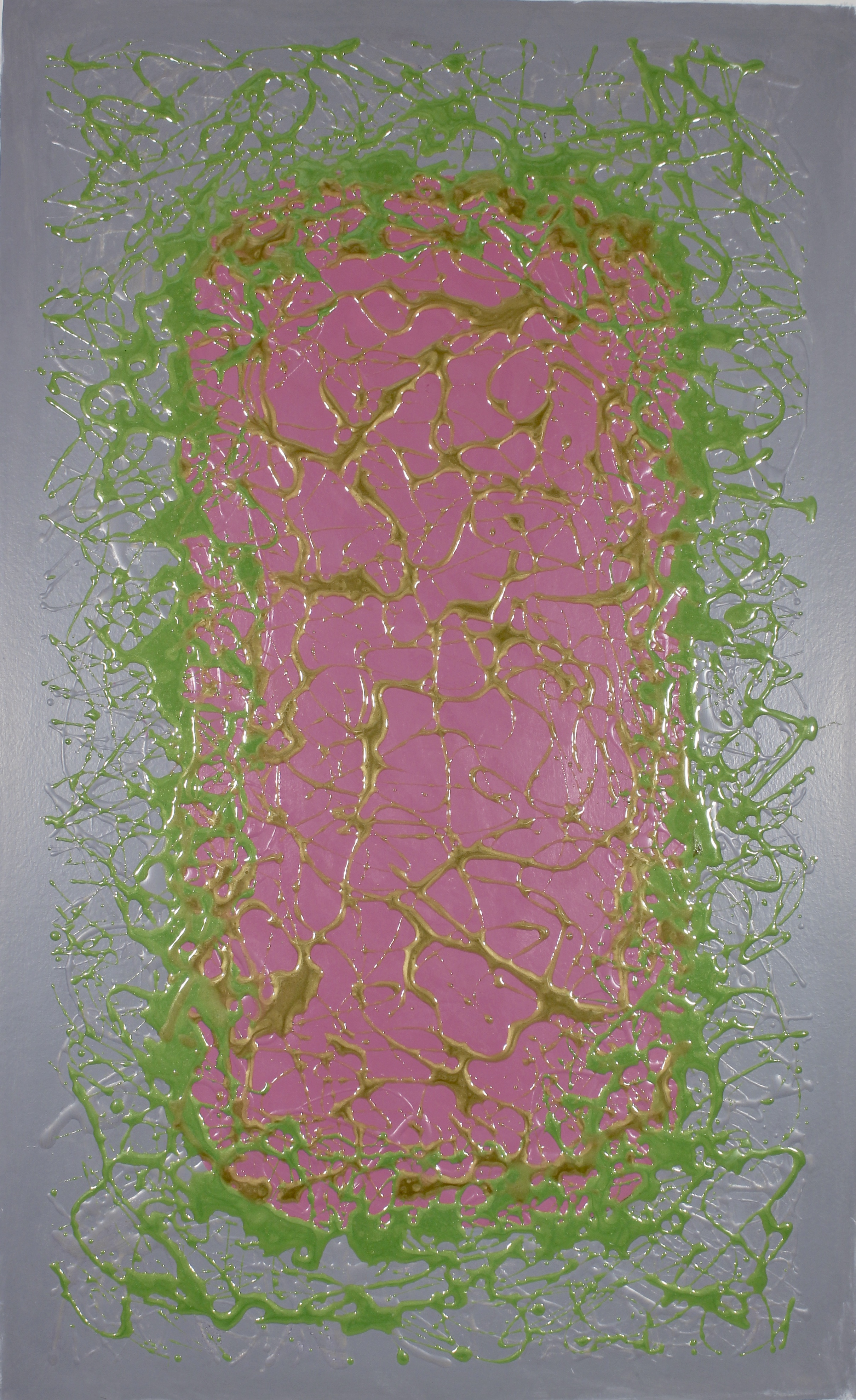
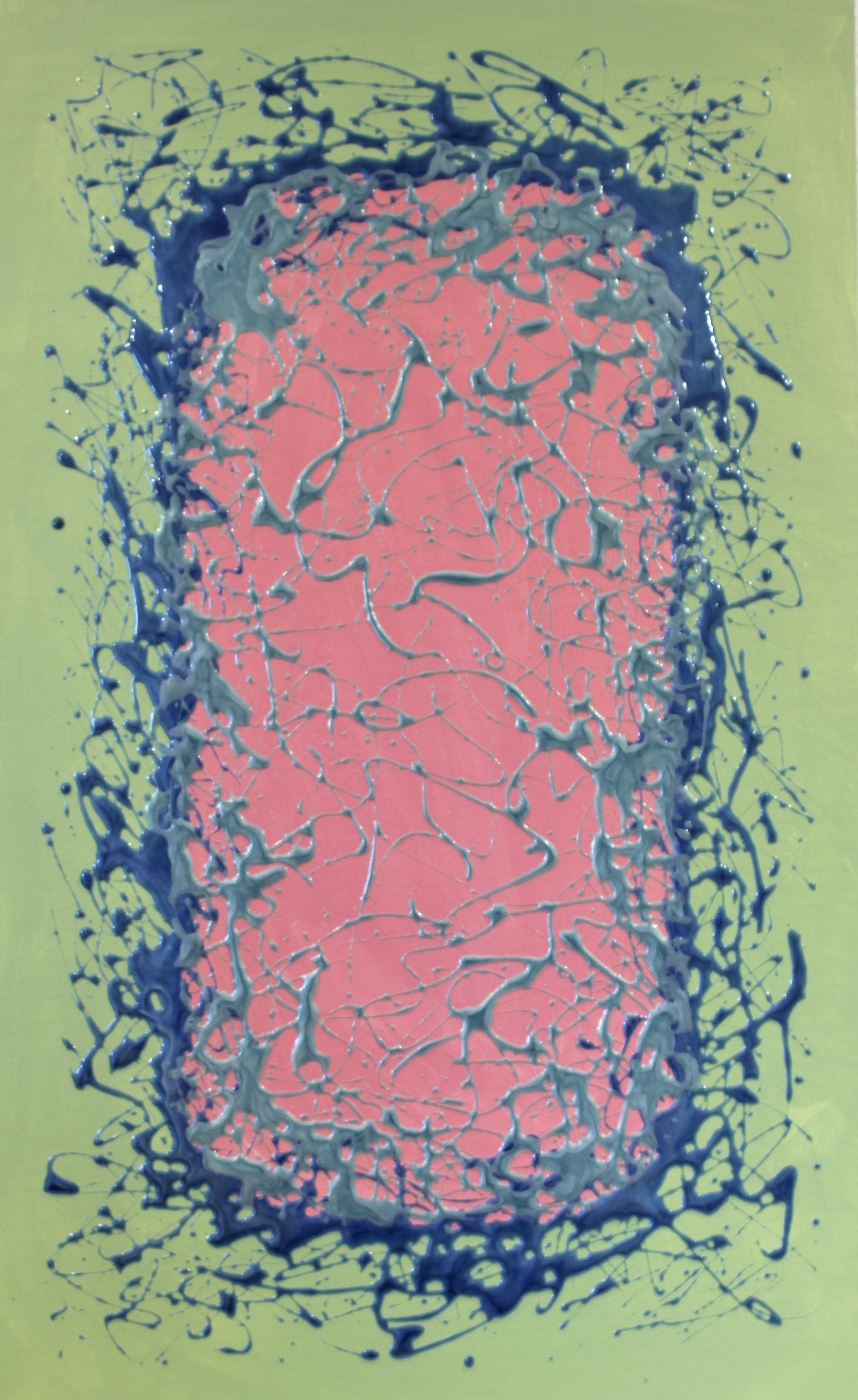
Color Blocking in Art today represents Modernism and abstract art is a sub-culture of that movement.
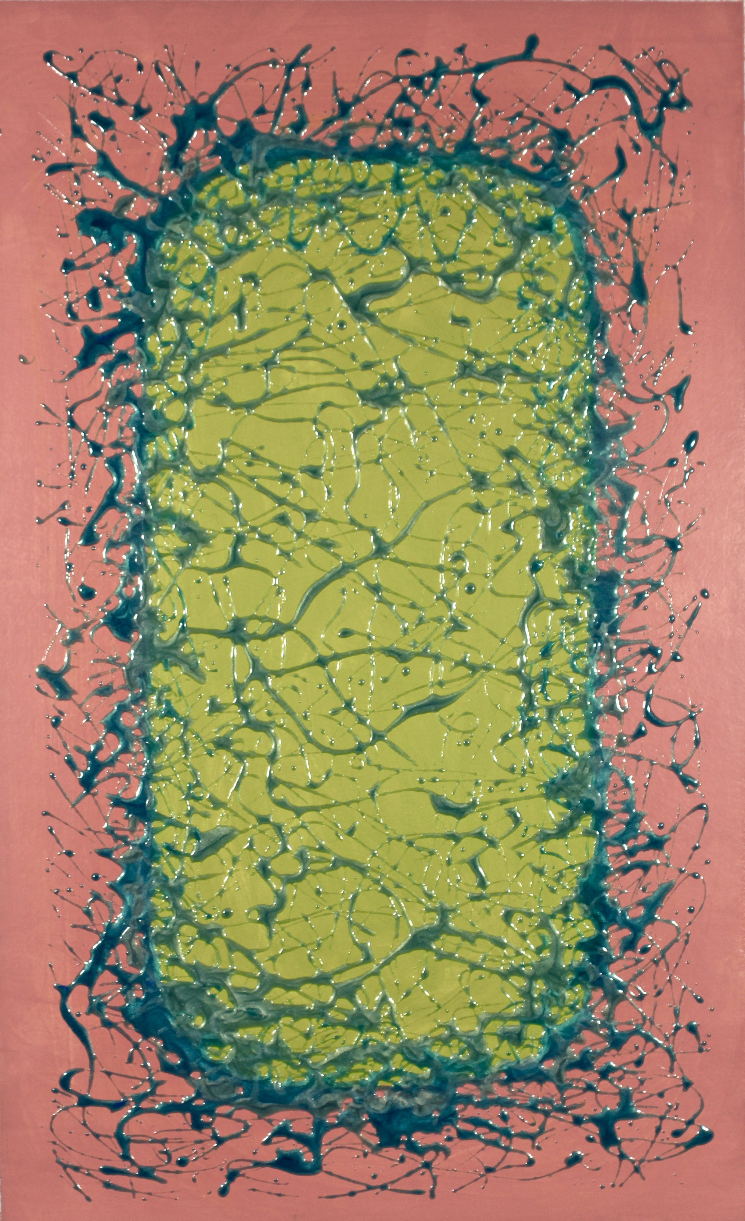
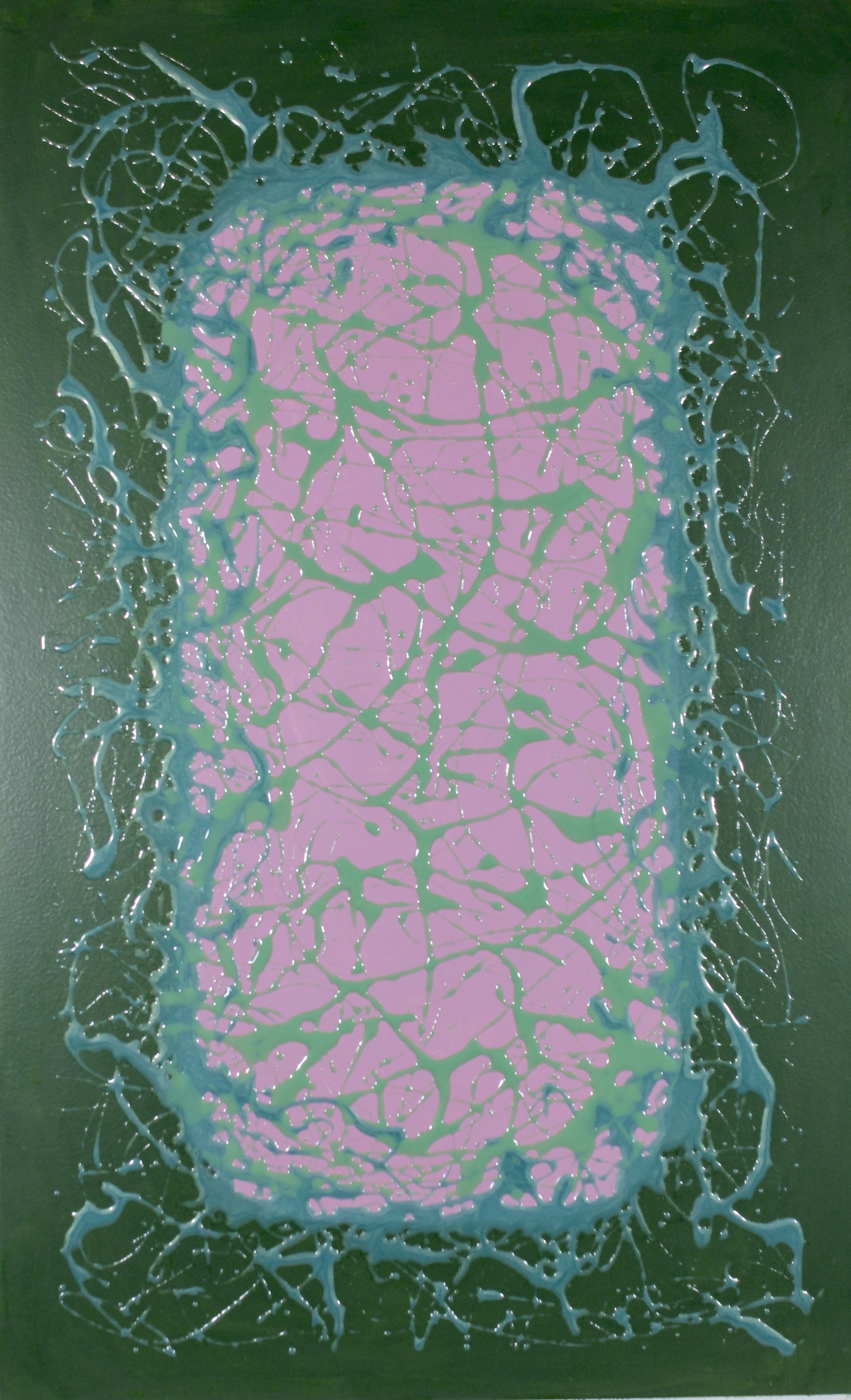
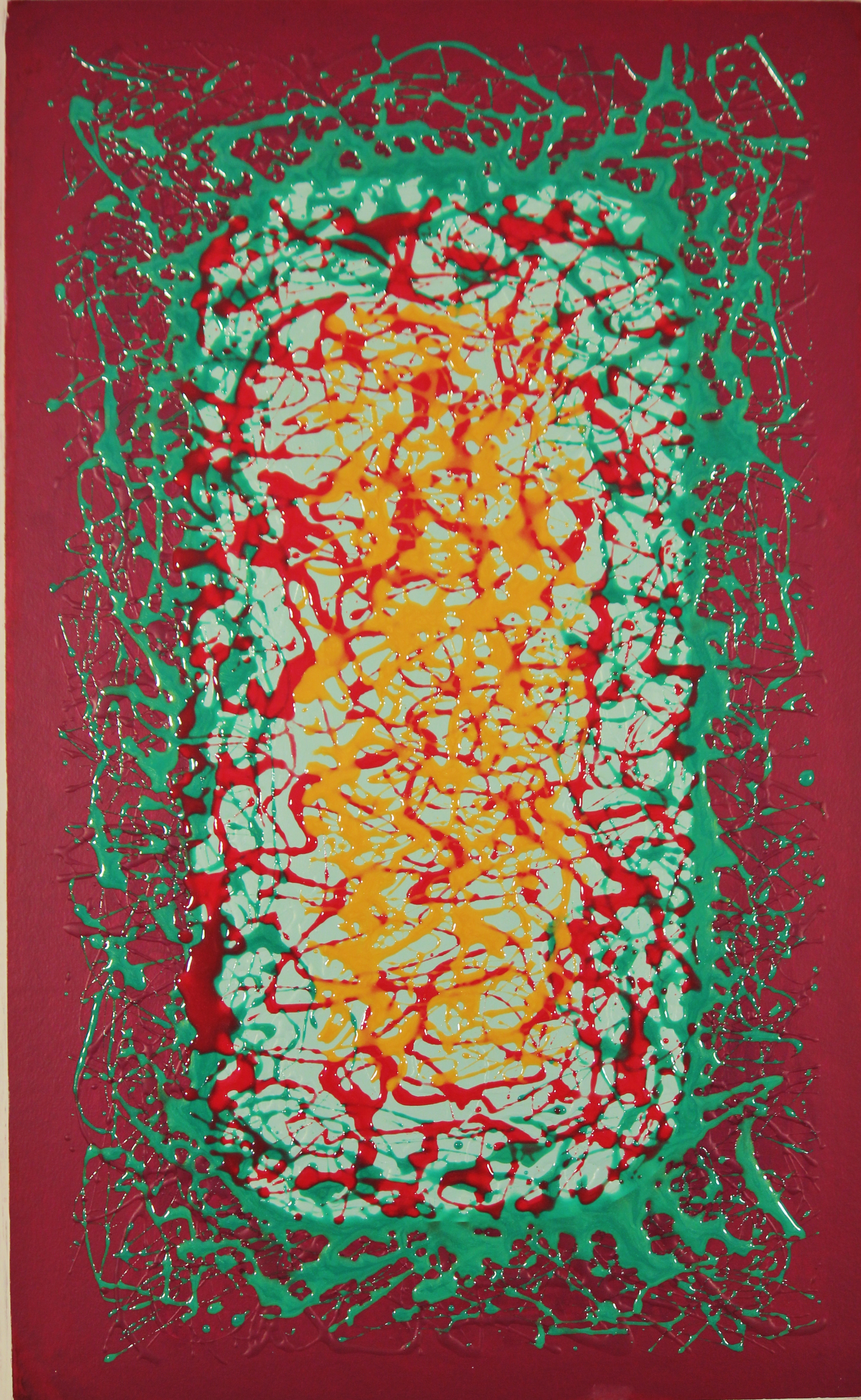
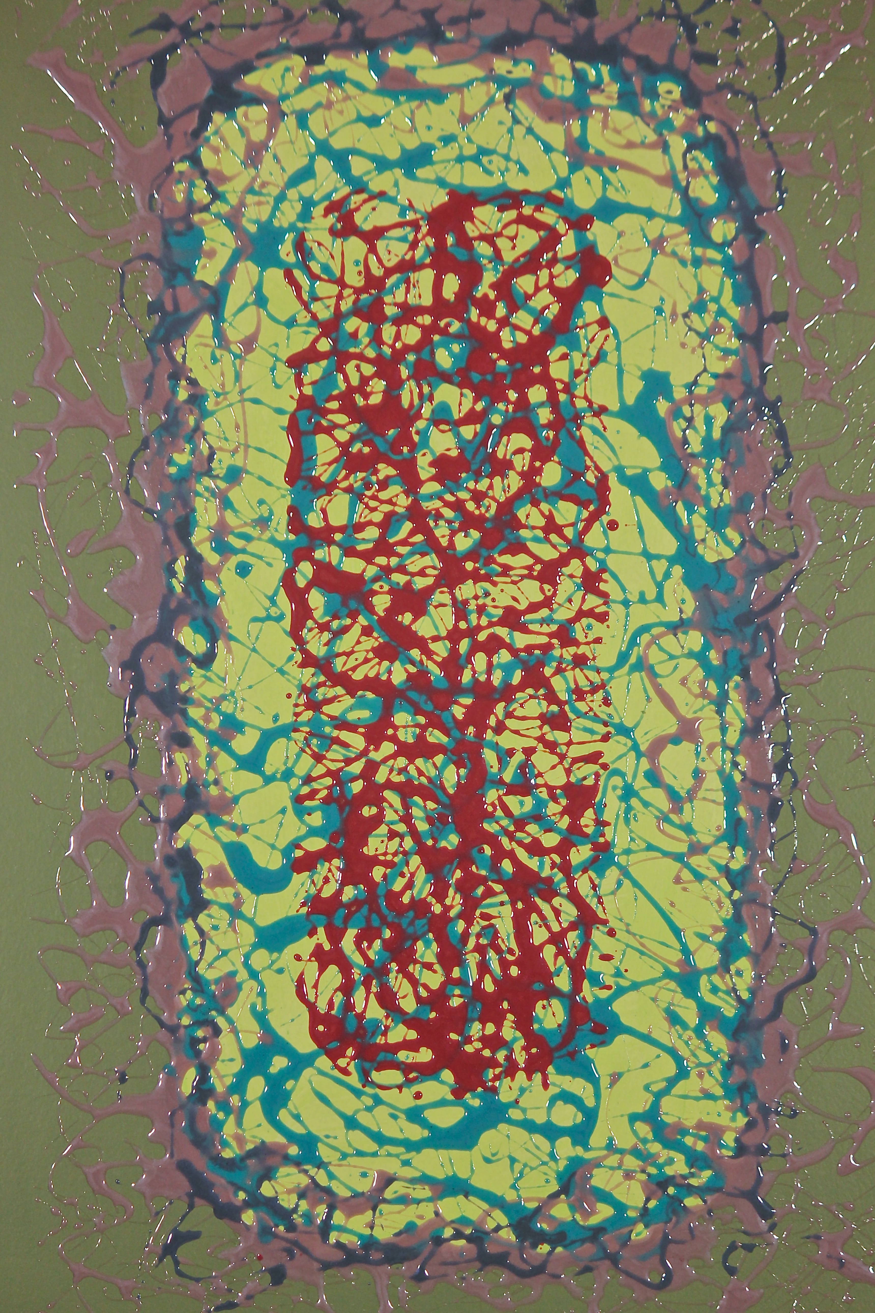
Color blocking or color field technique was used to illustrate a specific visual stimulus. These works of Art were rendered to exemplify how colors manifest themselves when placed side by side. These colors are known as complimentary colors and to make a stronger visual impact, the near to complimentary colors were selected. The composition is dedicated to the space and scope of how each color effects the other. The use of lines to soften and blend the opposite colors also brings your eyes to the strong dominate color.
A simplification of form and juxtaposition of complimentary colors, are applied in order to explore the strongest element of design, that being, color. Some experts believe that color precedes form in its impact on the human consciousness. Through our sense of sight we are exposed to a sensation, that gives us great pleasure. This series of art is titled Opposing Views. By Placing complimentary colors side by side in a blocking pattern, allows the striking contrast to emerge. The specific colors chosen are a deliberate act of a highly skilled craftsman. His experience and knowledge has created these designs to enable us to see a specific distinction of each color.